Have you ever been curious of how we develop colorways for our shoes? Our Product Manager, Russ Stevens, is taking you behind the scenes to explore the inspiration behind the new women’s color of Ultraventure 2 and how it came to life.
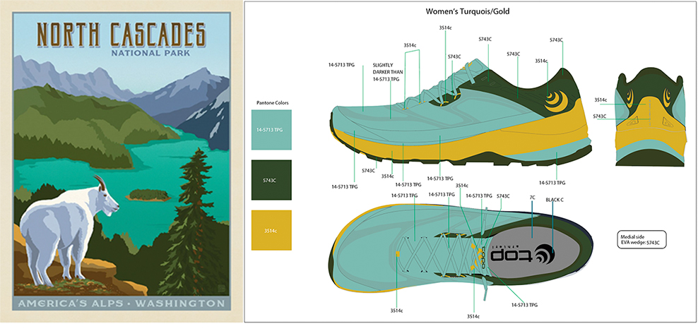
Rewind to May 2020, it all started with a National Park poster by the Anderson Design Group.
“The awe found in nature and that feeling of moving freely has always been the inspiration behind our trail shoe designs. While flipping through a book of National Park posters, I came across that poster of the North Cascades. To me, the colors evoked the spirit of adventuring outdoors, which is exactly what we wanted to encapsulate in this new Ultraventure 2 colorway.” said Russ.
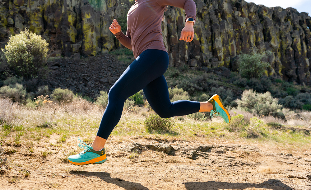
Russ showed the poster to Topo’s shoe designer, Kirk Swanson, who translated the poster into a mockup colorway to consider in a lineup of other potentials. When the turquoise/gold colorway made the final cut, the color specs sent to the factory and from there, the colorway was brought to life as a vibrant and exciting new addition to our best selling trail shoe.
What colors inspire you to get out there on the trail?

I love this color. I’m tired of the salmon /grey and burgundy shoe colors most shoe companies think women want . I LOVE this more nature inspired color theme. I look forward to running in these !